8.05.2011

A dining room transformed!

We are working our way through Beth's house one room at a time.  You may remember her bedroom makeover and you probably also remember what we did to her teenage son's room.   That was fun!   Now we are in her dining room.   The furniture didn't need to be replaced, in fact there was a beautiful table hiding under that tablecloth!  She was just tired of the wallpaper that came with the house when she moved in.  She basically wanted to update and freshen it up.   No problem!  

Here's the room, with the wallpaper that is just about old enough to be back in style again!   The rug is out of proportion to the table and corner cabinet made the room look a little off balance.

Another look...

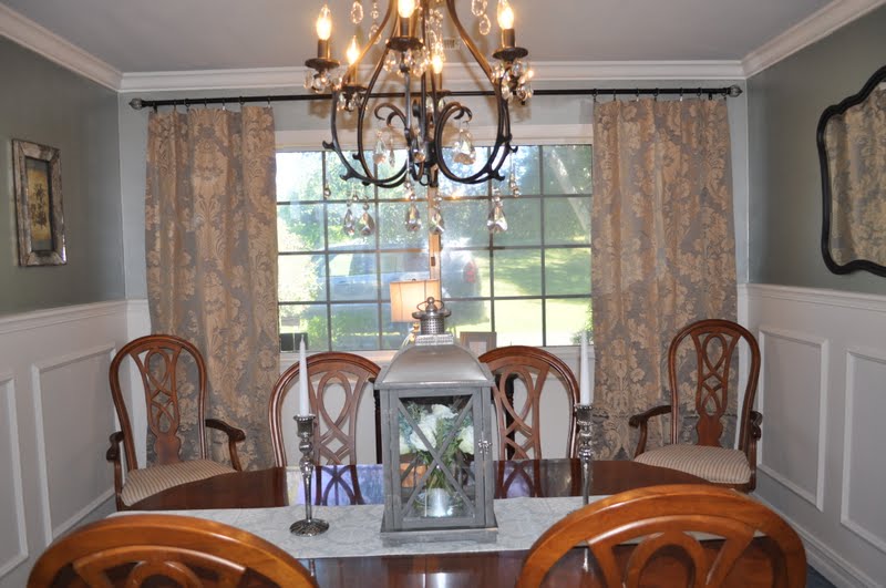
Check it out now!  We are calling this "casually elegant".    The moldings, curtains and chandelier all give the room a more formal look but we had to balance those with a more casual looking rug.
Accessories to the rescue!


Of course we need to give credit to Beth's son in law Jared who installed and finished the beautiful wainscoting and painted over the wallpaper.  (yes, painted over the wallpaper - that was definitely a wallpaper crisis averted!)  The walls were painted a blue grey color with a hint of metallic sheen.  

The curtains replaced an old honeycomb shade. The shade wasn't needed for light control and the fabric adds so much more to the room. 

The table was a last minute find.  

And a perfect place to use a cute lamp in the room.


A few sparkly touches in the mercury glass looking candlesticks and the mirrored pictured frames.  They both have a little patina to them that make them feel a little rustic and not overly formal.  Just like our room!


Can you tell we love lanterns too.  But they are just everywhere right now.  We wanted a little different centerpiece for this room.


The mirror was hanging in the upstairs hallway.  We thought it was such a pretty shape and it worked really well in this room.  Don't be afraid to steal things from other rooms!  

That ceiling with the new chandelier... Gorgeous!


The hutch got a little makeover too with a few new dishes and such.
But it was mostly rearranging things she already had.

Here's a peek inside.


Love that mercury glass lamp!  

See what we mean?  Casually Elegant!

7.30.2011

The Grand Finale!

So here we are at the end of Barbara's home tour.  But wait!  There's one last "room" we want to show you.  She had a small patio outside the living room/ dining room.  It was pretty much a depressing slab of concrete to begin with.  


Too much sun and it overlooked the parking area.  

But we had to make the most of it!

Some outdoor furniture and the rug definitely make a difference.  The umbrella doesn't hurt either.


An outdoor storage ottoman holds all her stuff that she doesn't want to store inside.

She said she didn't have a green thumb so we literally gave her a black plant!
We were hoping succulents would have a better chance of surviving.  

The candle ring on the table was a perfect find.


We added some lanterns and patio lights for evening ambience.


The hanging planters were a score from HomeGoods.  We planted them with succulents and now they beautify the boring beige fence.

We had to be creative out here.  It was our last room and the budget was wearing a little thin.   

The patio now blends in perfectly with the inside!  Just no zebra out here!


We put the fountain just outside her kitchen window so she can hear it while she is making dinner.


The perfect escape!

7.21.2011

The Great Room Revealed

We have just about come to the end of our tour of Barbara's townhouse.  We have the living room/dining room left to show and then just one last little surprise. This room really is where all the action takes place. It's the meal eating, tv watching, computer using, sleepover hosting and general lounging about center of the house.  They really needed to make the most of this small space.    

Here it is before... 
And after we brought our purchases from our secret hidden stash.   Barbara is really drawn to the color red.  So when we saw this bench we knew it had to find a place in the design scheme.


And the dining area before...


It's a pretty narrow space so she picked out a tall table that incorporates storage right into the base.


And there's Juan working his magic!

Loved the table so much I bought one for myself!

The baker's rack is our attempt to create some separation between the living and dining room.

We were relieved that the sectional actually fit in the room.  We had our fingers crossed as they delivered it!

You remember the zebra right?  Loving it in the grey!  And hey that's from Walmart people!

Some fun accessories always liven things up!

Artwork is really a personal decision.  It took us a while to get Barbara's style down.
But eventually we figured it out!


Cutest mirror!  Love the pillow!


One last look...


6.23.2011

We're Back... and the House Tour continues!

We have taken a little time off for some summer fun and much needed R&R.  But it is time to get back to work!  We still have more to show you from Barbara's house!  Let's head downstairs to the kitchen.  We had to liven up a plain white kitchen and guest bathroom.  Check it out...
Here's your basic white kitchen.

We kept the black and white theme from upstairs but popped in some red.  

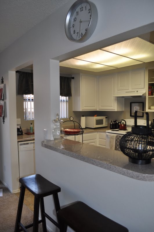
A little cut out that looks into the dining area.


Some barstools from Ross will hopefully make it functional.


Shelves and plate stands add storage and cuteness.


The rug had a little of the zebra feel and it tied all of our colors together!

Space is at a minimum in this kitchen so all the decorating had to come from stuff she needed to use.  


So another generic white bathroom.

A little zebra goes a long way!


We will post more later, but don't lose patience. The best is yet to come!